Future Fridays – Art & Poetry

We’re thrilled to bring you the incredible work of two New York City Teens! An art portfolio by Lola Simon and the debut poetry of Carol Brahm-Robin.

“My artwork focuses on desexualizing the female form.
In high school, faced with dress codes, I often found myself being told to put on a jacket because I was wearing a tank top on a hot day, when the boys in my class weren’t asked to do the same. I became uncomfortable with aspects of myself I couldn’t change. My junior year of high school, I took my first figure drawing class. Drawing the models, I gained a new perspective: the female body is beautiful and natural. I began drawing colorful illustrations of the body in order to further explore this theme.” – Lola Simon

Lola Simon is a senior at Fiorello H. LaGuardia High School in New York City, where she majors in visual art. Her favorite color is yellow and her favorite artist is Yayoi Kusama. In addition to creating her own art, she enjoys museums, and has interned at the Metropolitan Museum of Art and the Guggenheim Museum. She will attend Brown University in the fall.

Purple

 By Carol Brahm-Robin 

I woke
sunken deep
in a world of
Purple
 
What a nice
dream
swathed in mulberry hue 
 
Nobody
i could see
Except for
Purple
 
i was alone with it
Lavender dream
 
It wrapped its arms around me
Pulling me further
into plum
 
I breathed it in
orchid in my lungs
Too deep now
I Tried to inhale
only Purple
 
Only Purple now
I was alone
in amethyst chains
 
deep in a violet embrace
Drowning in Purple

Carol Brahm-Robin is a young writer who lives in Brooklyn with her parents and two cats. She enjoys poetry and cartooning. “Purple” is her first publication.

Life Within the Simulacrum: HTTPS://whatisthepurposeofgalleries.co.uk

Life Within the Simulacrum is a featured column focusing on technology & social media, travel & literature.

BY DALLAS ATHENT

(I Want To Make Something Huge by Camille Yvert, 2018)

The use of text and technology in art, though two varied subjects, share a similar issue–both of these themes are accessible in a way that almost any artist can produce fairly decent work using them. Anyone can make a painting that says something, and because it says something, it impacts you on the surface. Same with technology–it’s current, and since we live our lives with technology in the modern world and we are used to such objects, art utilizing this subject can be easily familiar to us on a personal level.

But it’s not often work in either of these mediums hits home in a way that you deeply internalize it, which was exactly what was so shocking about a recent show I saw in London, rightfully titled HTTPS:// curated by IKO at Sluice gallery. Upon entry, a large purple wall reads “Disappointingly Territorial” in dripping petroleum jelly–a work by Matilda Moors. Like a new-wave horror story, it blatantly depicted my own reflection as a young woman, navigating a need to create work out of crisis–a plea to be self-aware, honest and demonstrate talent for consumption all at once. These are common themes that transcend time for artists of all disciplines. However, they’re especially relevant during a technological revolution when the quest for love can so easily exist in the simulacra where we connect with others through web-based interfaces. Is this what the artist intended with this piece? I’m not sure, but it was a welcoming entryway to the other works in the show which equally addressed this particular sort of existential angst.

(View of HTTPS:// including work by Matilda Moors, Sam Blackwood & others)

Additionally in HTTPS://  Sam Blackwood created a piece titled Green Bottles, which consisted of bottles of wine with personal branding and flowers stuck in placed in clusters around the gallery. I visited the show weeks after it originally opened and the flowers had wilted. The progress in time was a morbid representation of what happens to the artists’ spirit as we succumb to self-promotion through the web. But maybe that’s just me projecting my personal issues. If you think this is the point of the exhibit in its entirety, however, keep reading. There’s a bit of a plot twist.

(Green Bottles by Sam Blackwood, 2018)

HTTPS:// had many other attributes that were carefully crafted, creating depth to what seemed so simple at a glance. There was a hard-drive that you could upload to your computer full of art by Chris Alton, a custom-made bench with plug-ins to charge your phone and IKO even provided free WiFi so attendees could freely find the artists online without draining their data usage. As I said, I initially gathered pieces of the exhibit were about both the pressure, longing and anxiety of having to self-promote as an artist, but after sharing this sentiment with Oly Durcan of IKO, he in turn, asked me a question. “What’s the purpose of an artwork in an exhibition that someone’s traveled to? We’re not telling people what the answer is. It’s an entry point.” I told him I felt like we were in the simulacrum (which literally 100% of people who have ever met me are probably sick of hearing by now, but hey, you’re here reading this review in my column just on that subject, so maybe you haven’t spent enough time with me yet–just wait!). More explicitly, I explained that when social media came out, it seemed a new way for artists to promote themselves while avoiding commercial influence, whereas now it’s the opposite. People now seem to make music, or paint or write in order to gain a larger following online. The validation through attention on the web has almost overcome the validation of someone buying your work. In the end, isn’t the point of making art to express your ego, or achieve love? Does social media not replace this purpose? I didn’t ask these last couple of questions in fear of seeming vain, but I thought it.

(Custom bench made by IKO for “HTTPS://, including “Live and Direct” By Dani Smith, 2018)

But Oly said something comforting. He said, “I think it’s a little like that, but it’s kind of–” and then did a motion with his hands like the scales were going back and forth. He was right. I was just being pessimistic 🙁 Upon further thought I realized the exhibition isn’t a critique of social media use in an artist’s life, instead, it’s about where does the experience of an artist start and finish.

I left the gallery wondering the same thing. I myself, have just moved to London and this was the very first review I’ve done of a show here. Where in the simulacrum do my relationships with those whose work I review begin and end? Life is art and art is life. We know this. In an attempt to make sense of it all, I went home that evening and made an Instagram post about my experience at the show, hoping it was somehow getting so meta and I could connect with my readers and the artists whose work I just admired. That was what HTTPS:// hoped to achieve, and dammit, I was going to try it out. I tagged Matilda in a selfie I took earlier that day in front of her work, as her’s was the one that stuck out to me when I first attended the opening–and then I got a notification hours later, that she followed me back.

IT’S KIND OF HARD TO EXPLAIN (IKO) is an artist and curatorial collective based in London that has been operating since 2017. HTTPS:// was on view from September 14th, 2018-October 6th, 2018 at Sluice Gallery in London

Dallas Athent is a writer and artist. She is the author of THEIA MANIA, a book of poems with art by Maria Pavlovska. Her work, both literary and artistic has been published or profiled in BUST Magazine, Buzzfeed Community, VIDA Reports From The Field, At Large Magazine, PACKET Bi-Weekly, YES Poetry!, Luna Luna Magazine, Bedford + Bowery, Gothamist, Brooklyn Based, and more. She’s a board member of Nomadic Press. She lives in The Bronx with her adopted pets.

A Conversation with Amir Hariri

BY M. SULLIVAN

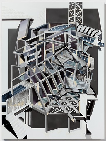
(BATH HOUSE, oil and acrylic on board)

“I want you to have that experience that you have walking down a quiet street and looking through a fence and seeing a dilapidated, brick building.” This is what Amir Hariri tells me as I look around his windowless studio on the seventh floor of a high-rise in Midtown. Somehow the small space doesn’t feel cluttered despite the significant amount of work along the walls, on the tables, and stacked in the corners.

At first glance, Hariri’s works do have the familiar look of a building. The components are architectural and structural, yet distorted. Not surprisingly, he studied architecture and engineering as an undergrad at the University of California, San Diego and he also holds a masters in structural engineering from Cornell.

His extensive background in these professional fields inevitably and understandably seeped into his work as a painter, producing abstract works that are compositionally and technically intricate. He considers his approach as similar to other “artist-engineers” or “technical artists” like Alexander Calder —  an American sculptor whose works often use kinetic energy or motor power.

“When I’m painting I’m exploring surface, depth, space.”

It all started with Cezanne, according to Hariri’s timeline.  Cezanne broke up the surface. And that’s precisely what Hariri wants to do. “There is a surface to be explored in a methodical, structural way,” he says, “and I want to explore the process of breaking down an object before we subject or burden the object with our own experiences.”

He had an epiphany while living in Williamsburg and the old Domino Sugar Factory was taken down. He realized he only truly noticed a building once it was gone. Our memories of ruins, the ruins themselves, and the ensuing deconstruction and reconstruction is what fascinates him and drives his work.

There’s a way we react to decay, either by succumbing to it or resisting it. And this idea creates a parallel between buildings and people — they are made, they serve a purpose, they die or are removed, turn to ruin, or they are preserved in some romantic way. With this in mind, he asks himself the question: “How do we create a subjective or subconscious experience of this?” That is, of the memory of a place, the feeling which a particular place can evoke, this passage of time, and of structure and decay. The key for Hariri is subjectivity and subconsciousness and the passivity through which these two things become ingrained in us.

“Memory does not document. It functions to document — but it doesn’t completely — at the same time it’s recording it’s becoming opaque.”

Before he starts a new work he will go to a place, but not to observe, not to take pictures or sketch drawings, but simply to activate his memory. He goes to visit — just to be there. He’ll talk to people, visit again, walk around, and then mull on these visits for weeks or months until all that remains is his subjective, subconscious memory of the place. Then he approaches the memory by painting, drawing, and sculpting. Soon an impression is formed — an impression influenced by the past but now also by the present as what he feels the day that he produces the work will naturally leak into the finished piece: “We cannot help but project our own condition onto things.”

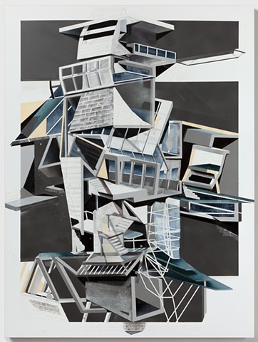
(VILLA NOVA, oil and acrylic on board)

He tells people to imagine walking the same street, the same corner, for years, going home or to work, and then one day you find yourself on the other side of the street and you see a blue awning that you’d never seen before. Your reality is unmade and remade in that moment. The ensuing surprise that mingles with the familiarity of the street is what he hopes to capture in his work. His works thus become the sum product of multiple experiences, and in this way he tries to communicate with the viewer — by giving them a multi-faceted, panoramic view. And this gives his works a truly cubist feel as you decide how to look at something from so many varied angles simultaneously.

It’s an attempt to get inside the viewer’s head. He wants to see what they see and portray every possibility. As such, he’s not interested in being “pure to the visual.” Instead he aims to take the three-dimensional and flatten it, giving his paintings an incredible amount of abstraction. By doing so, he hopes to question what the projection of reality is.

“‘When told the story of a prince turned into a frog and turned back into a prince, children have no doubt that the frog is still a prince.’ —Chomsky said that.”

Hariri chases this idea when he starts a new piece. To keep with the metaphor, he wants the viewer to see the frog and the prince in the same instance. He goes on to explain that people “build with associations” and as a result our eyes take short cuts. “Especially in abstract paintings — we look for short cuts: is it this, is it that?” And he wants to mess with these perceptions by distorting the perspective, changing the space and the relationships between objects in that space.

His overall goal is to create something which never becomes familiar — a piece where there aren’t any shortcuts, and the eye is forced to keep looking. This is how he feels he can best communicate with the viewer — through abstraction, because “abstraction strips something to its core,” something to which everyone can relate.

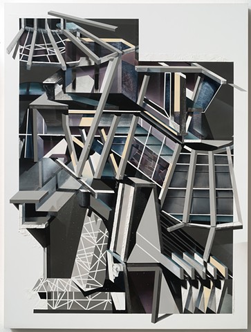
(RAW MANIFOLD, oil and acrylic on board)

“Roof is shelter, wall is separation — there’s a hierarchy and I use those archetypes to show you ideas in my paintings. So if I show you a stair I want you to move your eye up, if I show you a wall I want to stop your eye.”

In this way, the work is very analytical. He mentions a slew of painters from the cubist, dadaist, surrealist, abstractionist, and abstract expressionist movements and says that, to him, they are are all analytic painters. There’s something they notice that they keep coming back to, trying to figure it out.

This theoretical quality emerges in his interests outside of the studio-proper as well. One of his current projects is an app which uses computational aesthetics to analyze a scene and determine the best way to photograph the scene. Algorithms create feedback loops that point towards an ideally composed image. The algorithms can be calibrated and he even uses them for his own artistic practice. In this light, Hariri say, “I consider my work to be research” — continuing the long line of analytical artists before him.

M. Sullivan studied art and design at Northeastern University, English & American Literature at New York University, and is a current grad student in The New School’s MFA program. He lives in Brooklyn.

<3 BOOKS <3

PANK loves books!

Next month, we will begin reviewing them. If you’d like to join the team, please send us a greeting and brief writing/criticism sample at pankmagazine@gmail.com and we’ll start coordinating. If you’re a small press with big perspective, we’d like to hear from you too.

ATTN: Book Reviews

[REVIEW] Intimates and Fools, Poetry by Laura Madeline Wiseman with Art by Sally Deskins

Intimates and fools

Les Femmes Folles Press

38 pages, $14


Review by Jen Lambert


One of the things I admire most about poetry is that sometimes what’s not on the page is what’s most important. This vacancy is like an invitation in to the intimate space of self-interpretation, and it speaks volumes about the poet’s trust in her readers.

Intimates and Fools, a collaborative art and poetry book by Laura Madeline Wiseman and Sally Deskins, dedicated to the sometimes complicated female relationship with the bra, is the antithesis of vacant. Deskins’s own art, colorful sketches and body prints, unapologetically splash across the page in bright strokes while Wiseman’s handwritten prose snakes up and around, balancing and accompanying the art. The white space and sparse font that usually turns me on is clearly abused in this collection, but nonetheless, I found myself intrigued. This book required a different kind of poetic experience than which I’ve grown accustomed. It made me want to linger, to touch the page, run my hands across the color and script. It was more of an experience than just interpretation. The poems themselves were artistic, relying on a loopy longhand font, which at first I found distracting, but ultimately I grew to admire its comforting lines, personal and familiar. This collection has been called playful, fun, a “table top” book of color and tongue in cheek commentary on feminism, and while the premise is lively and energetic, even a bit feisty, I think it would be a shame not to recognize its deeply contemplative side as well. While the pages of this collection are full – Deskins’s brushstrokes and Wiseman’s stanzas crowd up against each other on every page – it’s what’s just under the busy surface that’s most appealing: the wildly complex social constructs of female body, and the symbol of the bra as the ultimate carrier of all things female: shame, sexuality, strength. Continue reading

[REVIEW] Music for another life, by Kristina Marie Darling and Max Avi Kaplan

music

BlazeVOX Books
77 pages, $18.00

Review by Anne Champion

Kristina Marie Darling, already an accomplished poet in her own right (she’s published sixteen poetry collections), has begun paving a new trail with her foray into collaborative writing. Her previous collaborations work alongside poet Carol Guess, but her newest work, Music for another life, collaborates with the accomplished visual artist and scholar, Max Avi Kaplan, and the finished product is a brilliant and moving piece of art. The cover, featuring a Marilyn Monroe look-a-like donned in Jacqueline Kennedy inspired attire, chillingly depicts a woman laying in grass in a corpse pose, and this image foreshadows what’s to come: stunning, delicate beauty that adheres to societal standards juxtaposed with hauntingly devastating realities.

The narrative, composed solely of short prose poems, follows a speaker named Adelle as she traverses her lavish landscape in heels, swanky sunglasses, and pencil skirts. Each page features a different picture of Adelle—either standing outside of her domestic sphere or lounging in nature. The work of light and shadow in these photographs speaks volumes to the Adelle’s search for self and inability to find it, either from being blinded, outshined, or blurred into unrecognizablity. Some of the poses only vary slightly, so you can flip through the pictures quickly and watch Adelle move as if she were an animation. Regardless of the various ways you can look at and interpret the images, the most important thing they do is immerse the reader in a very real and detailed world: paired with the poetry, it’s hard not to empathize with the character while also feeling as trapped and suffocated as she does, despite the fact that she clearly frolics in an upper class status. Maybe even because of it. Continue reading